Designing trust for a product nobody believes yet.
The problem wasn’t awareness. It was disbelief.
VirtuaizeAI reads Indian customs documents and pushes clean data into SAP. It works: 3,300+ documents in production. But its core claim, 99%+ accuracy, is the identical sentence every OCR vendor that already burned this buyer used.
No logos. No testimonials. No case studies. Every conventional trust device was unavailable.
The stakes were concrete, and the site says so plainly: every shipping bill is a tax on an exporter’s time and a leak in their incentive claims.
- 3.2 hrs
- lost per shipment to manual entry
- ₹2–4 Cr
- unclaimed RODTEP per year
- 43%
- of SAP entries carry errors
Principle: demonstrate, don’t claim. Where a claim is unavoidable, show its receipt.
Three decisions that carried the site
01 · Product second, problem third.
Convention is hero → problem → solution → product. I inverted it. This buyer lives inside the problem daily; explaining their own pain back to them wastes the highest-attention scroll. So the second thing they see is a working, clickable dashboard, because a static screenshot reads as a mockup and interaction reads as a product.
02 · Show the failure states.
The dashboard displays a stalled claim, a duty mismatch, two failed SAP pushes. Every marketing instinct says show the happy path. But a dashboard with no exceptions looks fake to anyone who has run operations. Proving the system catches problems beats proving it never has any.
03 · Argue spatially, explain afterwards.
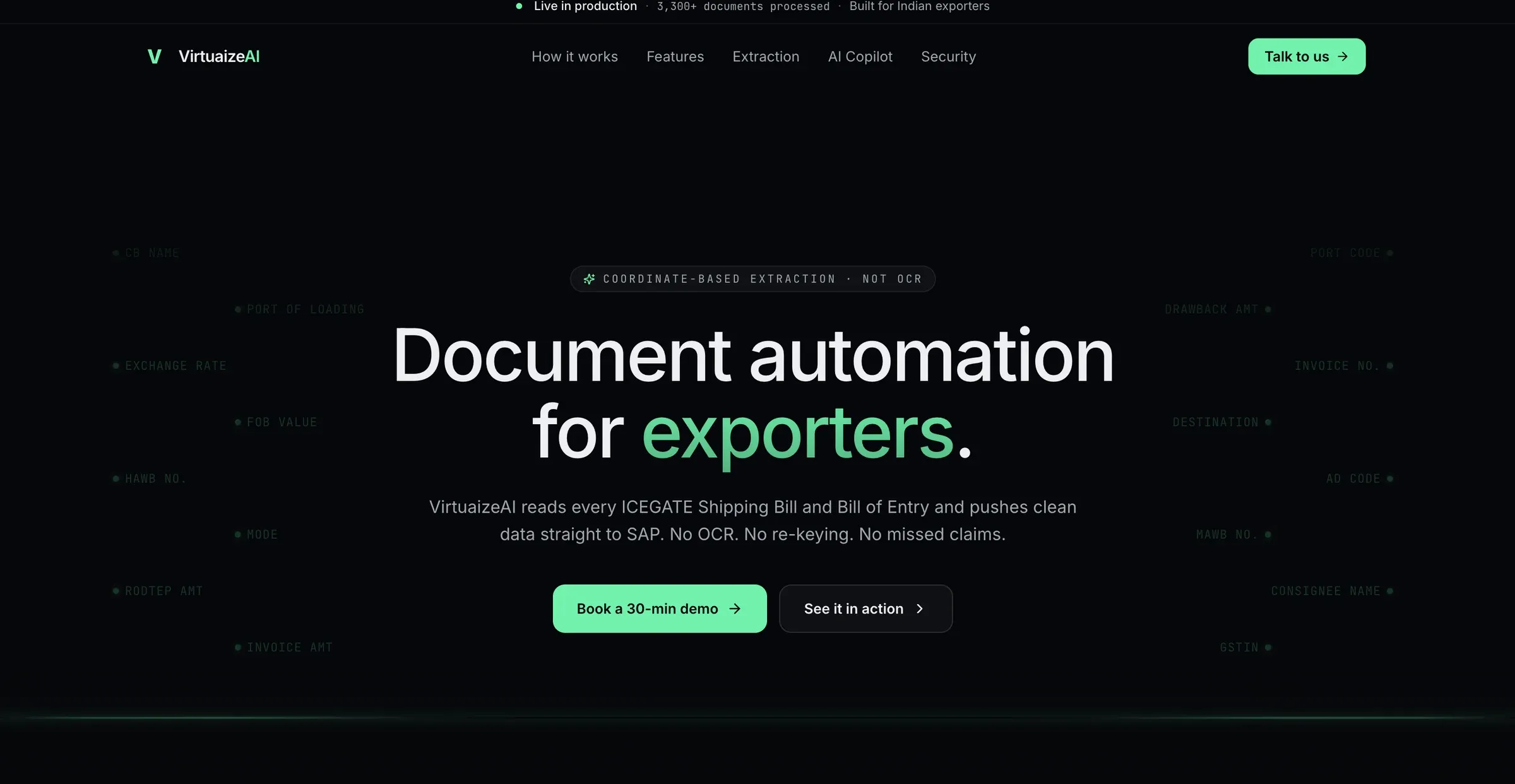
The hardest problem on the site: explain coordinate-based extraction, not OCR, to someone with no vocabulary for it. The solution: a scroll-driven split where fields illuminate at exact coordinates on the left and structured output populates on the right. The explanation lands after the demonstration, as confirmation.
✕ Rejected: a comparison table (asks the reader to take your word for both columns) and an animated “AI scanning” sweep (looks exactly like the OCR association we were fighting).
How it got built
Three stages. AI in two. Judgment in all three.
| Stage | What happened | What I held |
|---|---|---|
| 1 · Author | Design system and every screen built in Figma with Claude via MCP. Tokens defined by hand first, generation constrained to them after. | The token contract: nothing generated into a value that didn’t already exist. |
| 2 · Validate | Founder review. Requirements finalised against a concrete design, not in the abstract. | Deliberate sequencing: founders can’t specify, they can only react. Seeing a real screen surfaced requirements no brief had named. |
| 3 · Build | Developer vibecoded the functional site from the Figma source plus my written constraints. | The rubric held the line: each section was regenerated until it passed every gate, however many passes that took. |
The loop, identical at stages 1 and 3: intent brief → generate → grade → written critique → regenerate.
The rubric: nothing shipped that failed a gate
- ✓Intent does the section do its one job in 3 seconds
- ✓Tokens zero values outside the contract
- ✓Hierarchy squint test
- ✓Honesty every claim demonstrated or sourced
- ✓Optics right by eye, not by measurement
Five ways generated UI goes wrong, and how I caught each
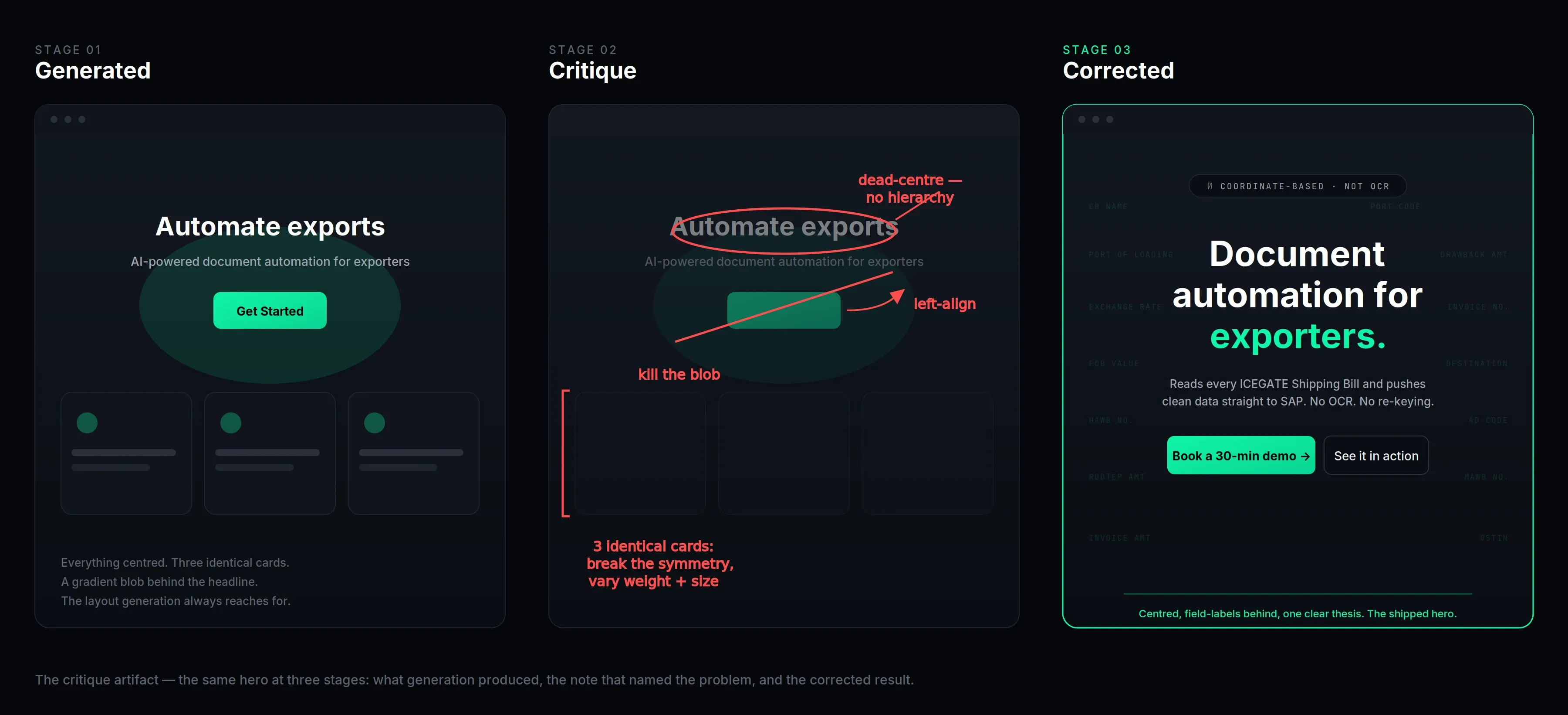
Working this fast with AI generation, the same five failure patterns showed up again and again. Naming them is what made them catchable: once I could recognise a pattern in one sentence, I could write a rule that stopped it recurring. Each row is a failure I kept seeing and the check I put in place against it.
| The failure pattern | How I caught it |
|---|---|
| Template gravity. Generation drifts toward the same safe layout every time: centred hero, three-card grid, a gradient blob. | I specified composition and asymmetry in the brief, not just which components to use. |
| Token drift. Stray hard-coded values creep back in over successive edits, quietly breaking the design system. | An allowlist plus a diff check every round: nothing shipped that used a value outside the tokens. |
| Motion without meaning. Everything fades up on scroll because the model adds animation by default, not by intent. | A motion budget: one narrative animation per viewport, and it has to earn its place. |
| Fake affordances. Something styled as a button that does nothing, because generation copies the look without the behaviour. | An interaction inventory: every element tagged interactive, decorative, or state-only. |
| Optically wrong, mathematically right. Spacing that’s technically correct but looks off to the eye. | This one can’t be pre-specified, only caught by looking, every round. It was my most-written note. |
The first two showed up at both stages, in Figma and again in code. They’re properties of generation itself, not of any one tool.
The ceiling on a generated interface is set by the precision of the judgment applied to it, not by the tool.
Generation made producing an option nearly free, which inflated the value of knowing what “right” means and being able to name a deviation in one sentence.
The system underneath
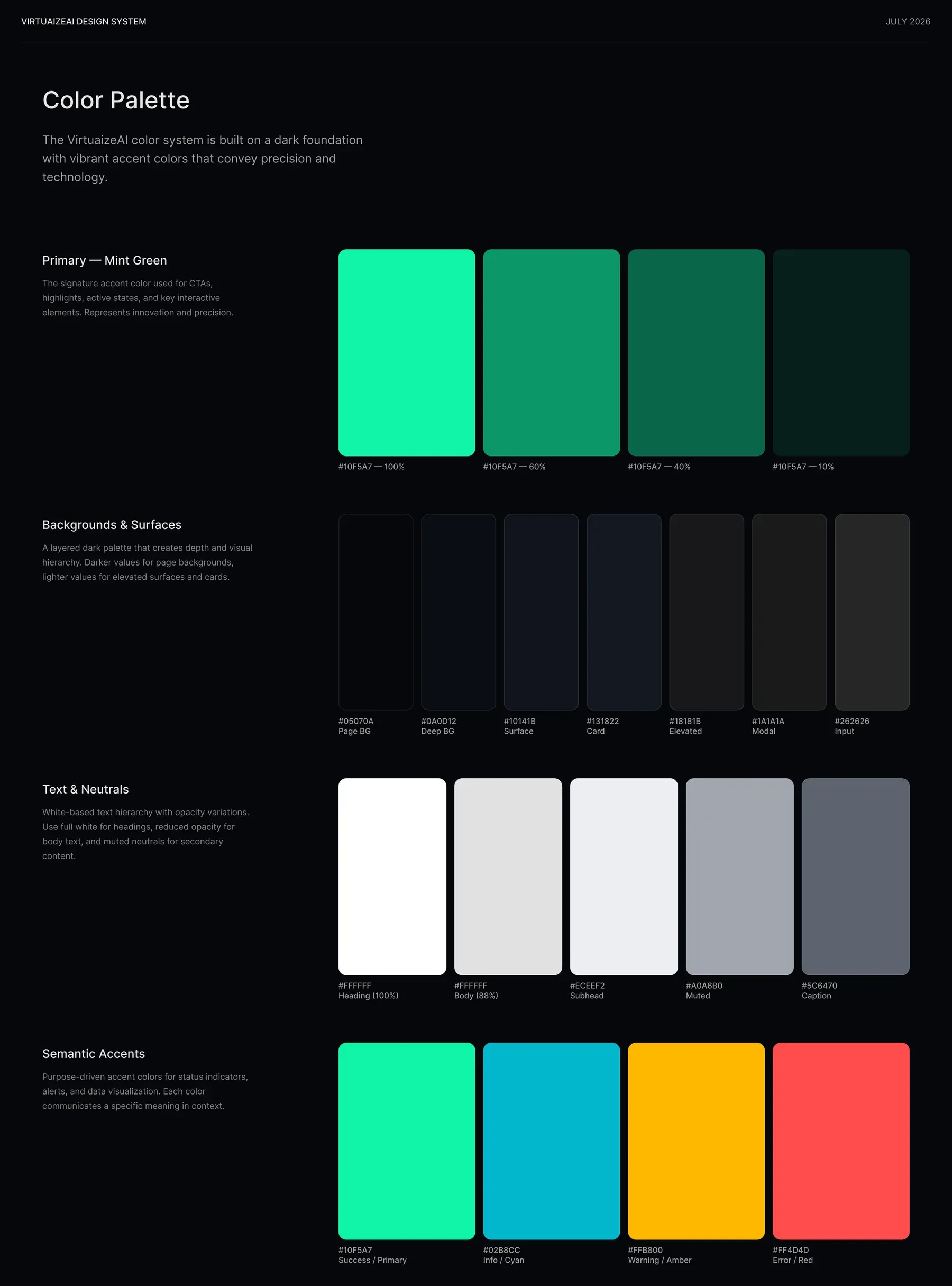
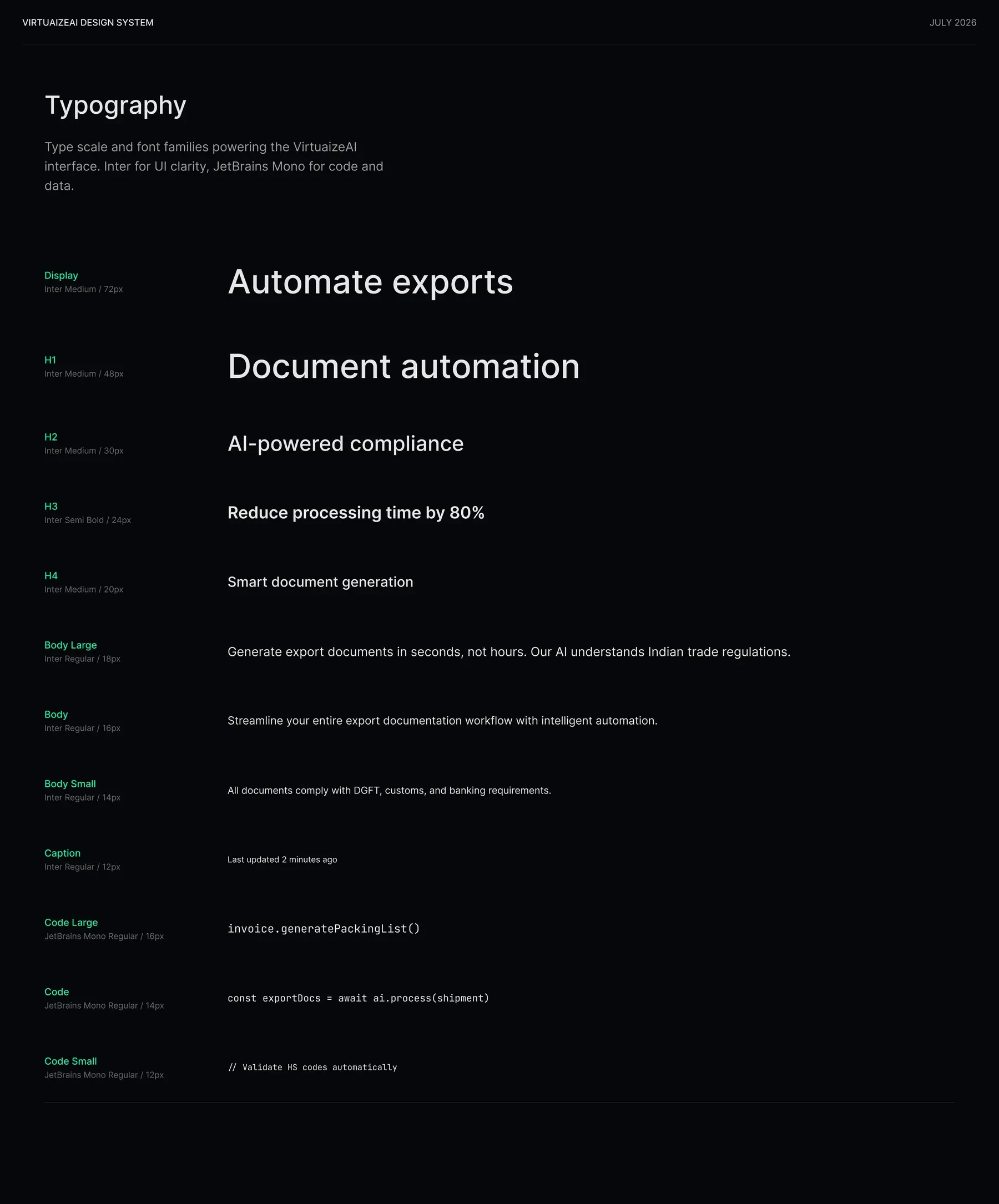
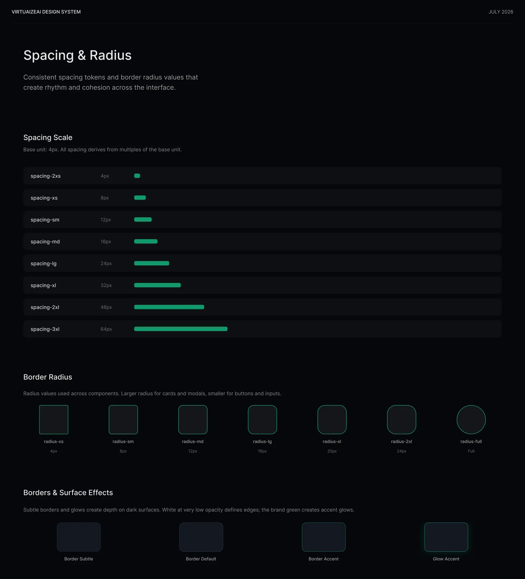
None of the generation would have held together without a system to constrain it to. I built a dark-first design system for VirtuaizeAI: a single mint-green accent (#10F5A7) carrying every CTA and active state against layered near-black surfaces, Inter for interface text paired with JetBrains Mono for the code and data the product is actually about, and a 4px-based spacing scale that kept rhythm consistent as the site was regenerated section by section.
Outcomes
The site is live and in production at virtuaize.com, carrying the real product behind it. Brand, design system, and the full marketing site shipped in two months, built alongside one developer with no design-to-dev handoff gap.
It’s early, so I’m not going to claim conversion numbers I can’t stand behind. What I can say is that the trust argument holds up in front of the exact buyer it was built for: the demonstrate-don’t-claim structure gives a sceptical, previously-burned EXIM operator something to interrogate rather than something to take on faith.
What I’d fix
-
No usability testing with EXIM operations staff. Timeline. The IA is founder-validated, not user-validated, the weakest evidentiary link and the first thing I’d change.
-
Motion cost on low-end Android. India-first audience on non-flagship hardware; the extraction section is the heaviest thing on the page. I’d profile it on real low-end devices and add a lighter, reduced-motion path rather than trusting the animation to degrade gracefully on its own.