Unifying a five-module enterprise analytics platform, from fragmented tools to coherent system
The problem
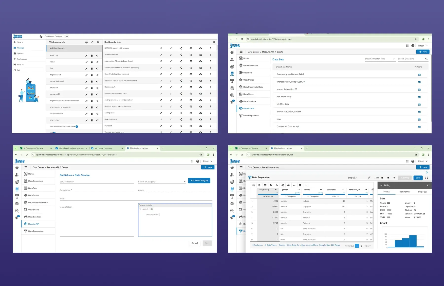
Each of the five modules had been built by a different team, on its own timeline. The same action behaved differently depending on where you were standing. Analysts described it as five separate tools forced under one navbar.
Navigation confusion and missing empty and error states were the two highest-volume support ticket categories. There was no dark mode, no accessibility support, and no shared component vocabulary between design and engineering.
Constraints, and what they forced me to prioritise
Six engineers maintaining a live codebase with paying customers, so a big-bang redesign was never on the table.
I sequenced foundational changes first (tokens, typography, spacing) because they compound across every screen without component-level rewrites. Component redesigns followed only once the token layer was stable. The same logic applied to information architecture: I reorganised navigation before touching any module’s internal UI, so the mental model shifted once rather than five times.
Restructuring IA around analyst workflow, not engineering taxonomy
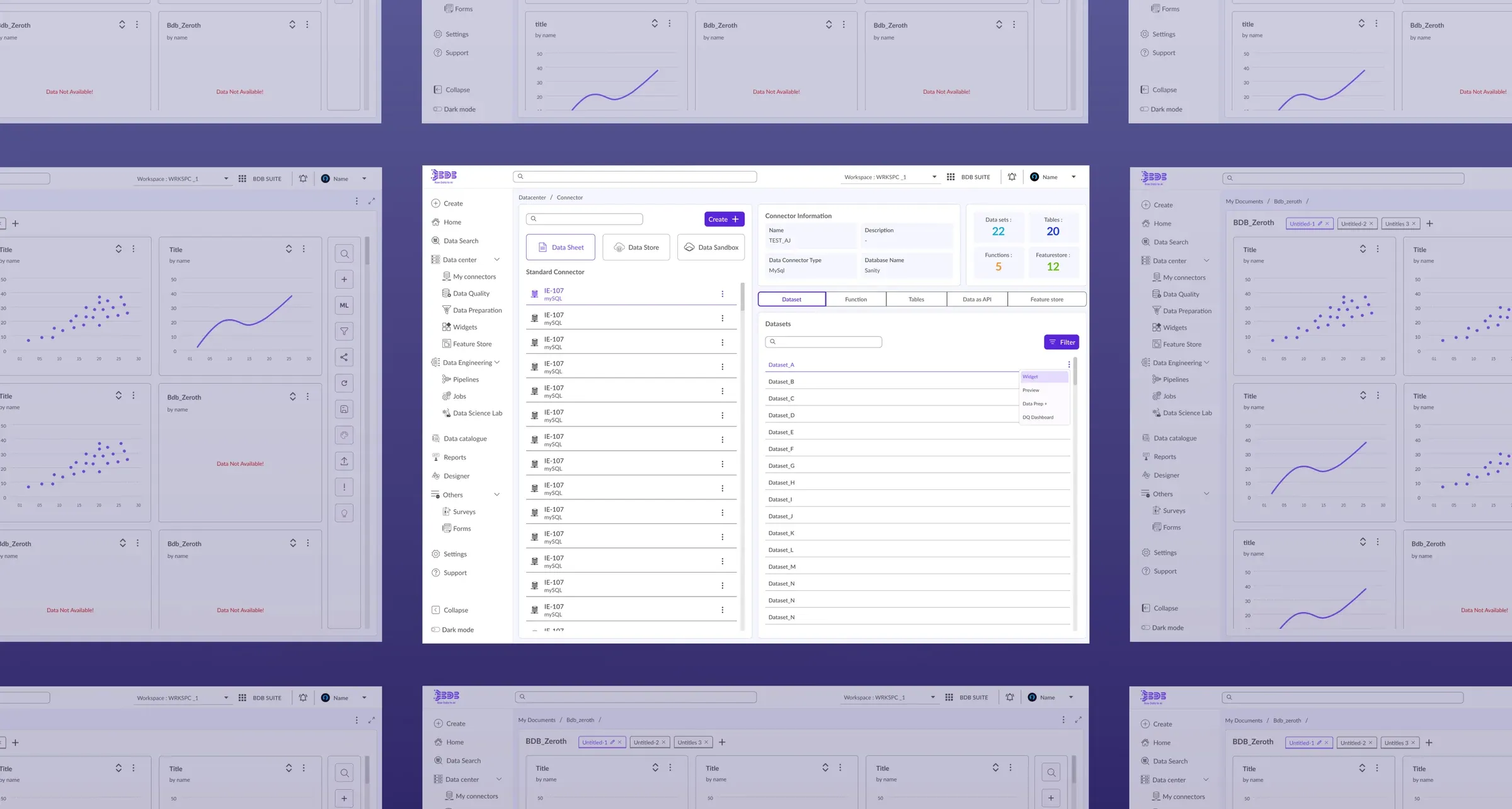
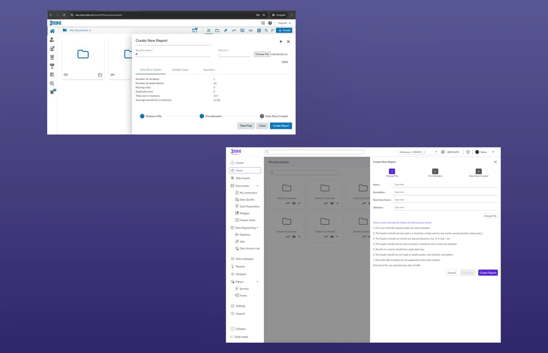
Navigation was grouped by technical category, logical to the teams who built it but meaningless to the analysts using it. I reorganised the left rail into workflow-phase clusters (Data Center, Engineering, Lab, Designer, Reports) mapping to the actual stages of the analytical pipeline: connect, transform, model, visualise, share.
The design system as connective tissue
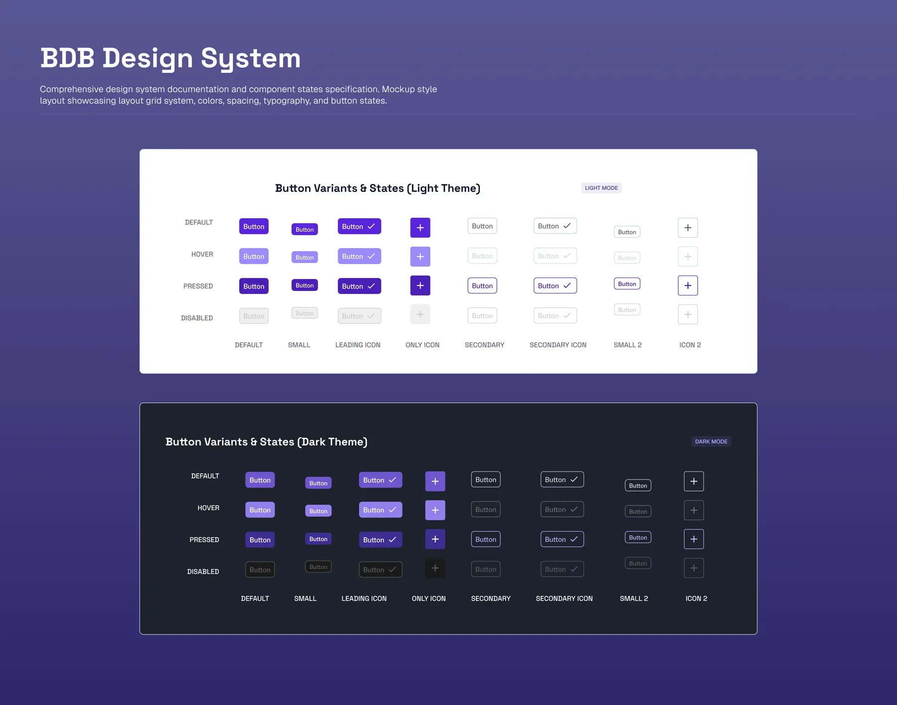
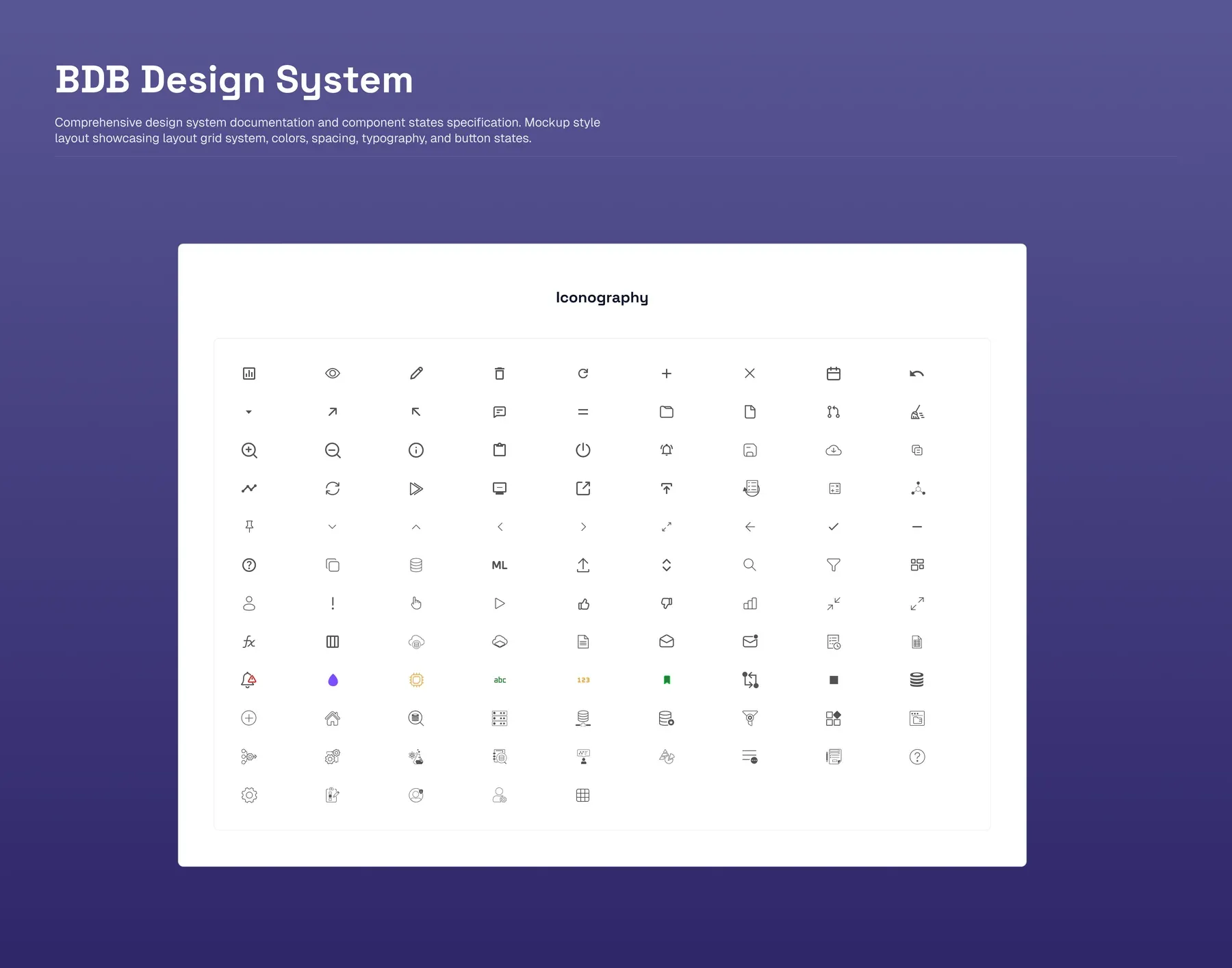
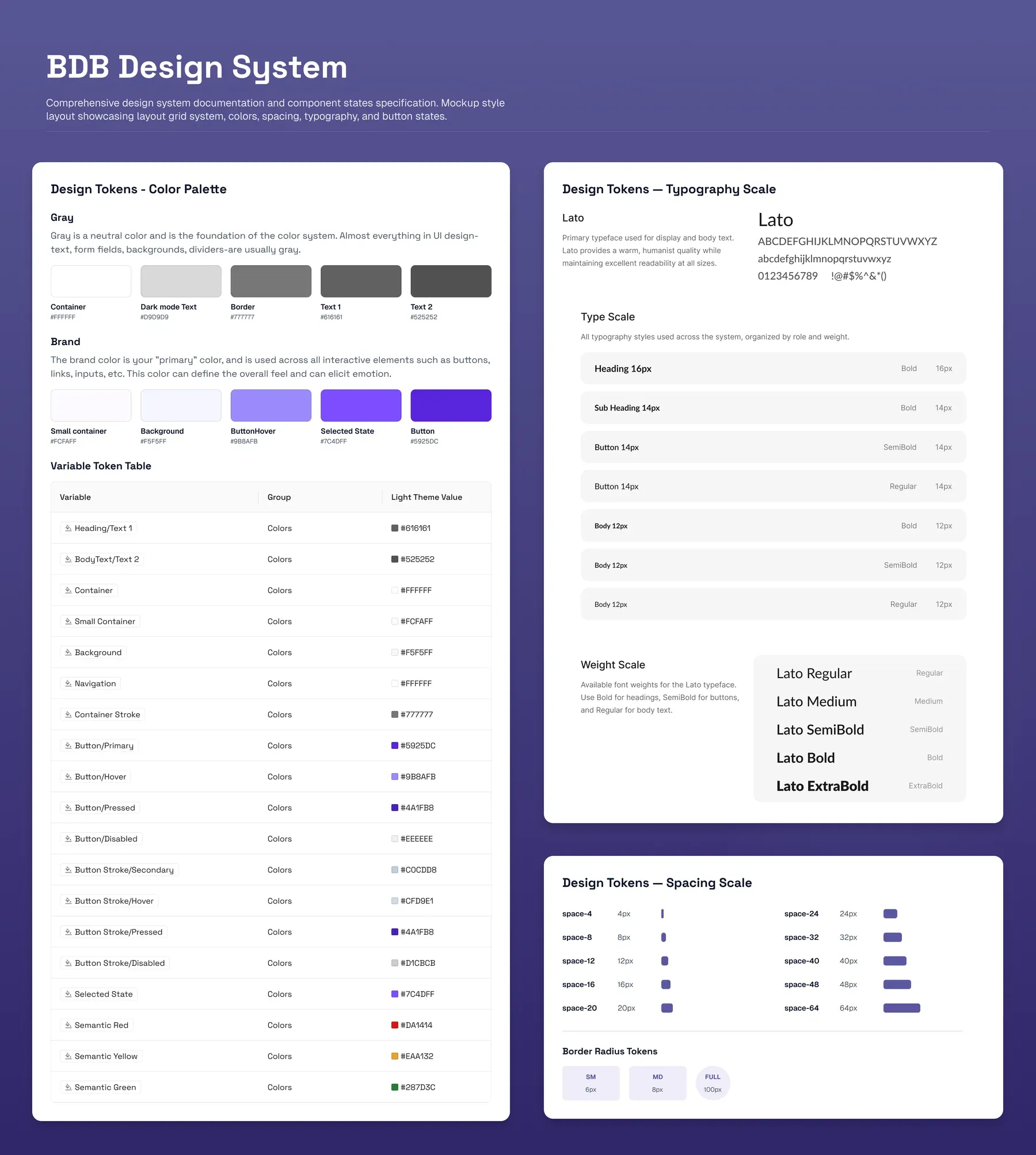
Five module teams had no shared language. I built a tokenised design system: a neutral grey palette, a single brand purple for every interactive element, a type scale tuned for data-dense views, and spacing rules that normalised density across modules, with every component documented across all of its interaction states.
The real tradeoff was scope. I kept the component inventory deliberately narrow: around fifteen high-frequency components with full state coverage, rather than forty with gaps. With six engineers, adoption mattered more than coverage.
Feedback and empty states: fixing the top support driver
Missing system feedback generated more support tickets than any feature gap. Skeleton loaders for async operations, contextual toasts that carry an action path, and guided empty states that turn a blank screen into an orientation moment.
This was the highest-return intervention in the entire redesign, and among the cheapest to build.
Accessibility and dark mode as performance features
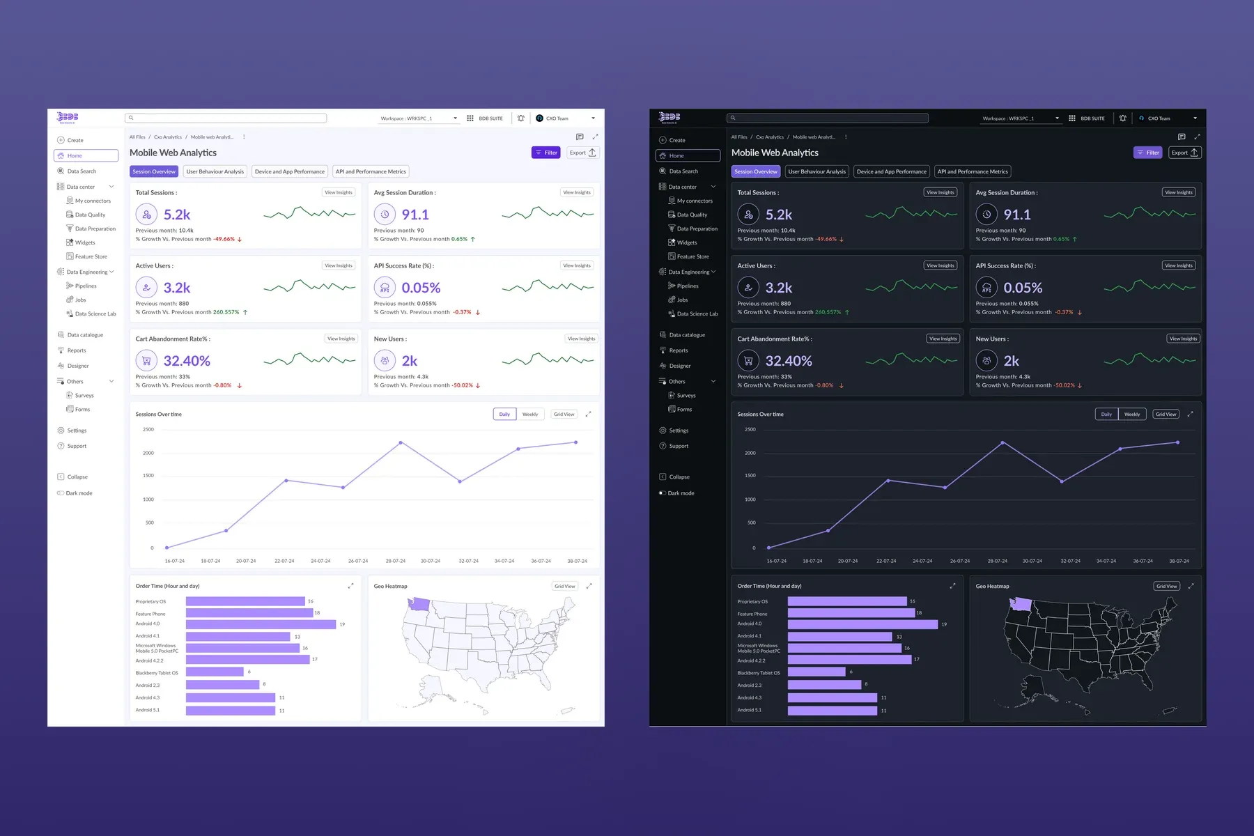
84% of users opted into dark mode within the first month. Analysts sit in this product for six to eight hours at a stretch, and at that duration dark mode is a performance feature, not a preference.
The tokenised colour system made full light and dark parity possible at WCAG AA, with keyboard navigation and ARIA labels across every component. Because the architecture was token-driven, dark mode was a system-level theme swap rather than a per-screen effort.
Two AI surfaces, two different trust problems
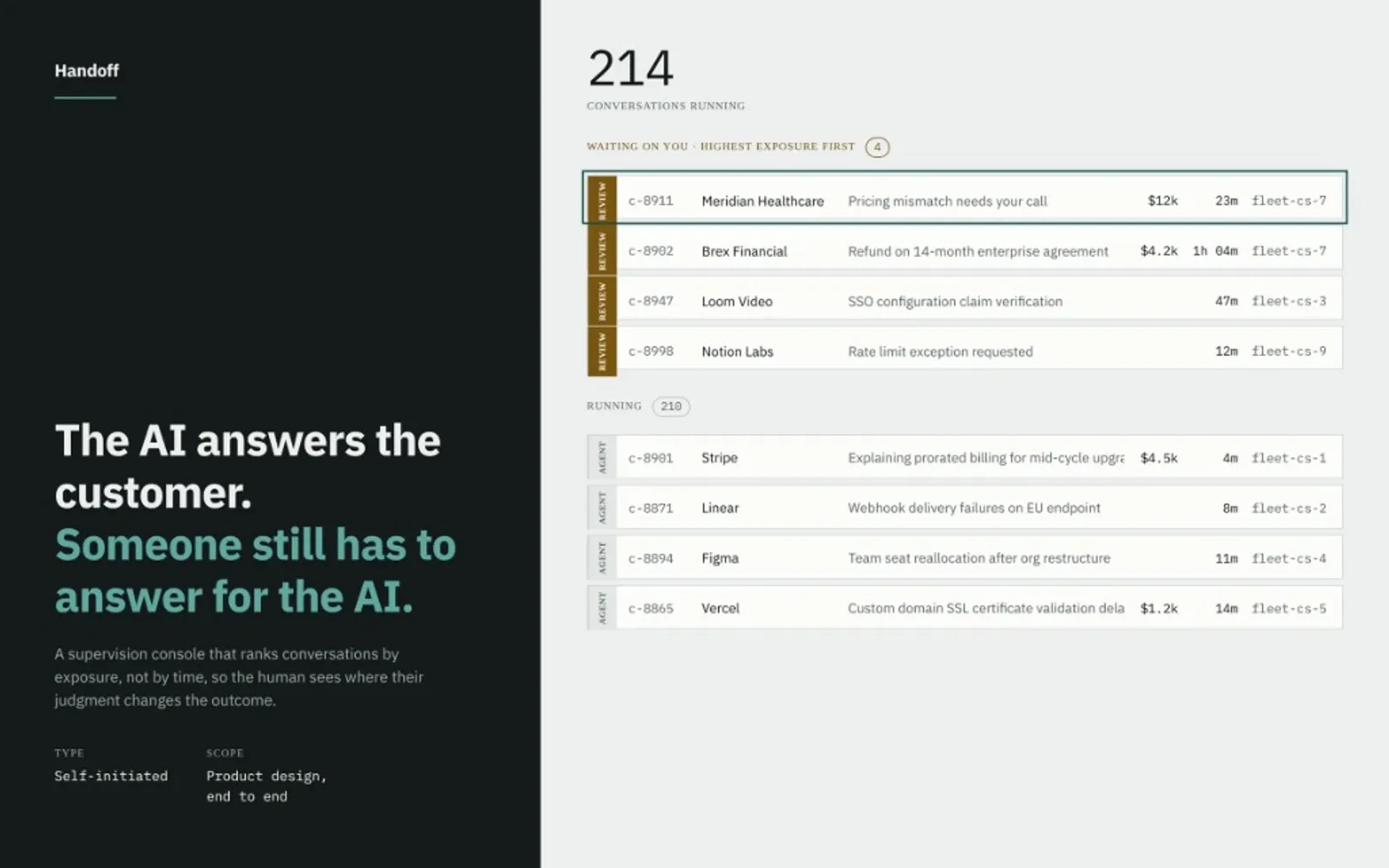
The platform has two places where AI meets the analyst, and each needed a different answer to the same question: how do you trust a machine with your data?
A scoped data agent: trust through scoping
The first surface is where an analyst builds an agent, not where they chat with one. Rather than a general assistant with access to everything, each agent is given an explicit scope: a specific data source, a hand-picked set of tables, and optional supporting files. It can only answer over what it was granted.
That scoping is the trust mechanism. An analyst knows exactly which data an agent can see, because they chose it. Example questions defined at setup then seed the chat, so end users arrive already knowing what the agent can answer, with no blank box and no guessing at its limits.
An embedded copilot: trust through grounding
The second surface sits beside the dashboard, not on top of it. The copilot opens as a panel next to the live metrics already on screen, so the analyst reasons with the AI against numbers they can see rather than a detached chat.
The empty state carries a few concrete starter prompts drawn from the data at hand, which do the work of teaching what the copilot can actually do. It answers in the same visual language as the rest of the product, so a generated result reads as part of the analytics, not a chatbot bolted on.
The principle across both: AI extends the analyst’s reach without taking their judgment out of the loop. One surface earns trust by making scope explicit; the other by staying grounded in the data already on screen.
Impact
- 32%
- faster module navigation, on task-completion timing
- 40%
- fewer mis-clicks after standardising action placement
- 40%
- less self-reported visual fatigue
- 84%
- dark mode adoption in month one
Navigation and empty-state support categories both fell after rollout. The design system was adopted across all five modules within the engagement, eliminating the duplicated component work that had been slowing every sprint.
All figures are self-reported or directional across roughly 50 enterprise accounts, not controlled A/B tests.
What I’d do differently
I’d push for phased usability testing during rollout: card sorting to validate the IA restructure, and moderated task-completion tests per module.
For the AI surfaces specifically, I’d run trust-calibration studies: do analysts actually verify AI outputs before acting, or do they over-rely? That answer would reshape the inspect-path design significantly.