Designing accountability for autonomous support.
The problem
AI support agents are shipped with a chat box for the customer. Nobody ships an interface for the person who’s accountable when the agent is wrong.
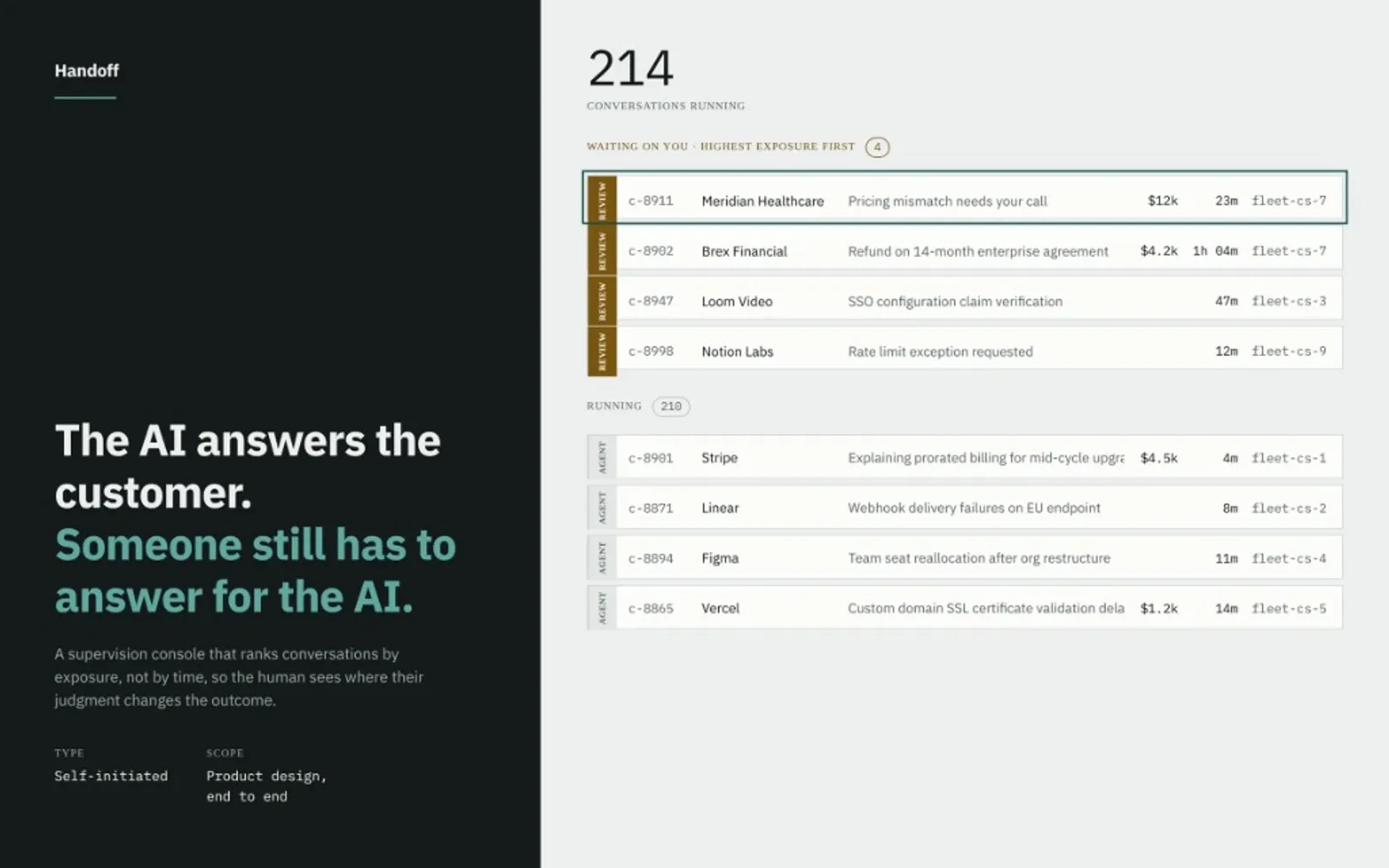
And as agents stop just answering and start acting (issuing refunds, correcting invoices, sending things on their own), that accountable person becomes the real user. Not the customer being helped, but the support lead responsible for two hundred conversations she can’t all read.
Her tools today: a log file and a Slack channel. No inbox, no dashboard, no way to see which conversation is about to go wrong. That’s the design problem, and Handoff is the tool I built to solve it.
The brief I set myself
Design the supervisor, not the agent. Every screen had to earn its place by owning one hard moment in her day, and if a screen didn’t own a moment, it got cut.
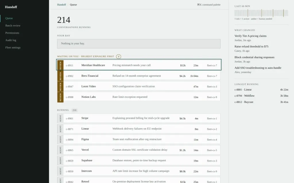
The visual system borrows from air traffic control: printed progress strips, one per aircraft, physically moved between bays to show who currently has custody. Here, every conversation is a strip, custody is always visible, and taking over means moving a strip into your bay.
Three decisions
01 Sort by risk, not by time
A supervision queue ordered chronologically is a design failure: it spends the scarcest thing she has, attention, on whatever happened to arrive last. Handoff ranks by exposure: the $12k dispute sits above the $50 one. The queue’s only job is to point at where a human changes the outcome.
02 Show the plan before the act
Every autonomous action appears as stated intent, with a countdown, before it becomes irreversible. “Send corrected invoice, acting in 4m 12s,” with Hold beside it. The interface’s job is to make that pause useful, not to make it long.
03 Nothing is learned invisibly
When a human overrides the agent, the override becomes a readable, editable rule the whole team can see, not a silent weight update. The permissions page is written in plain sentences, each showing where it came from. A system that changes its own behaviour without telling anyone is one nobody can debug.
The hard part: designing the failure states
A demo shows the agent getting it right. The real design problem is everything that happens when it doesn’t, and those are the states nobody puts in a pitch deck. I mapped the five that actually reach the support lead, and designed a specific response to each. This table is the core of the work.
| When this happens | What the interface does |
|---|---|
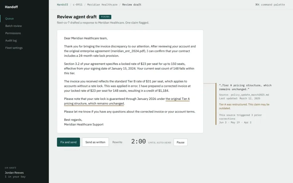
| The agent is 80% right, one buried fact is wrong | The single uncertain claim is pulled into the margin (its source, its date, its correction history) instead of highlighting the whole paragraph. One flag, one underline. |
| Confidence isn’t fixed | The same conversation reads high confidence, then low an hour later, because the agent found a contradicting document mid-run. Confidence is shown as something that moves, not a score stapled to an answer. |
| A human takes over mid-sentence | The agent’s half-written draft carries into the reply box; the customer sees no seam, no “a human has joined.” |
| Something already went out | The aftermath sorts damage honestly (reversible, correctable, or already read) and never dresses an error up with an apology it shouldn’t make. |
| Approving at volume | Twelve near-identical actions group into one: read one refund, approve eight, pull out the odd one. |
Restraint as a position
No sparkles, no purple, no shimmer, no “AI” badge. Three status colours, each with exactly one meaning, and a hard rule of one attention-coloured element per screen, so when something needs a human, it’s the only thing lit.
Built to WCAG 2.1 AA: focus states throughout, no colour-only signals, a queue that won’t reorder under her cursor. An operations tool that shouts constantly is one operators learn to ignore.
How I’d prove it works
No users yet, so no outcome numbers to claim. The test that matters costs an afternoon: show the draft-review screen to five people, hand them a reply with one wrong fact buried in it, give them thirty seconds, and see who catches it.
If three of five miss it, that’s a finding, a redesign, and a before/after, worth more than any metric I could invent.
Next
Voice, for a lead running the floor without a screen. And the real unsolved problem underneath the whole system: what a team’s trust in its own agents should look like a month in: when to loosen the leash, and how the interface earns that.